Anchoring the design on genuine driver needs
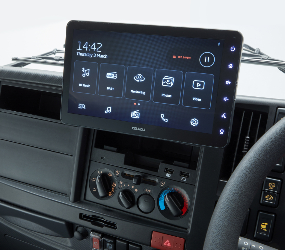
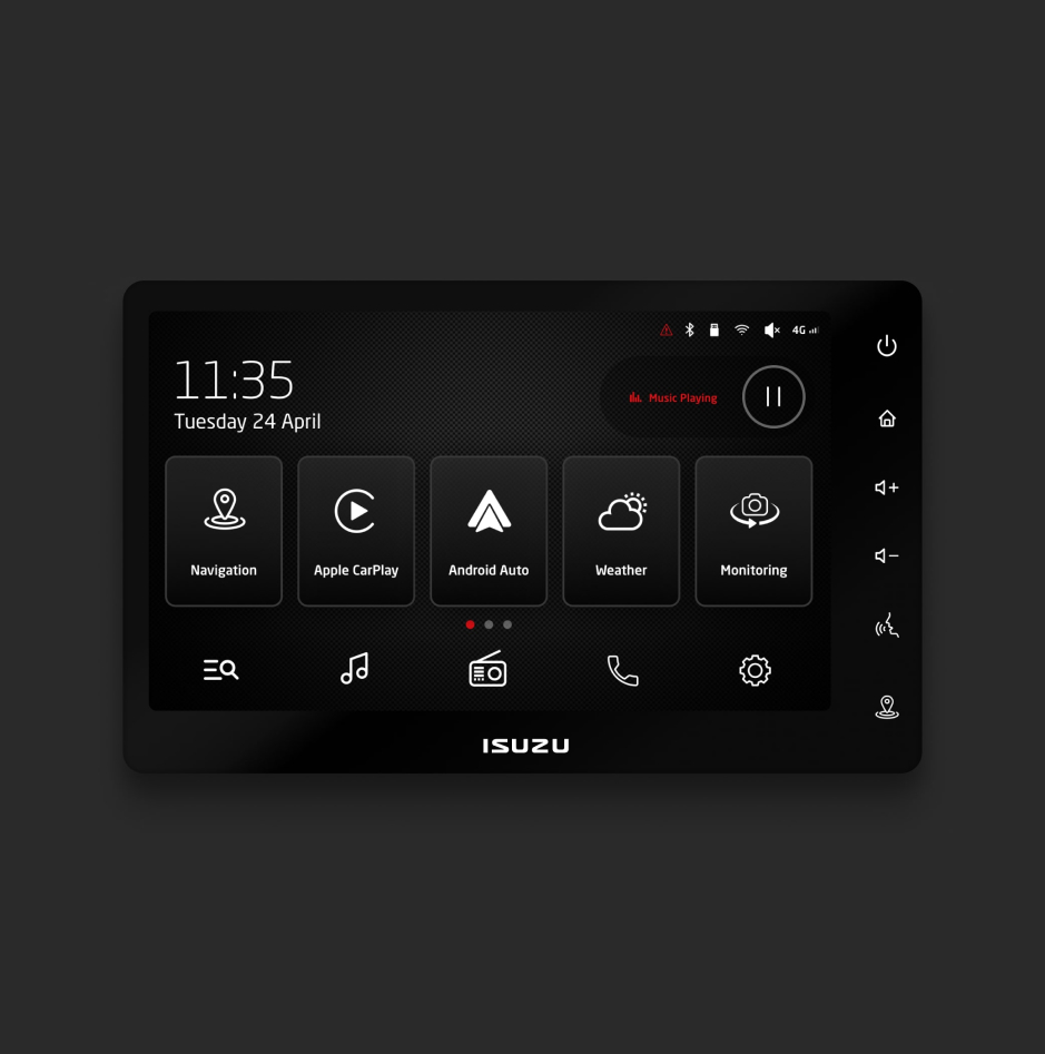
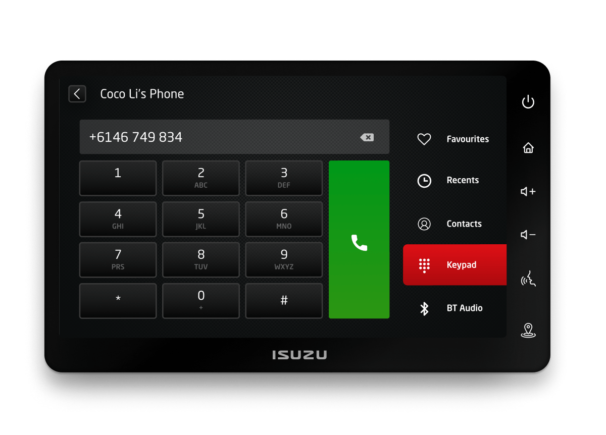
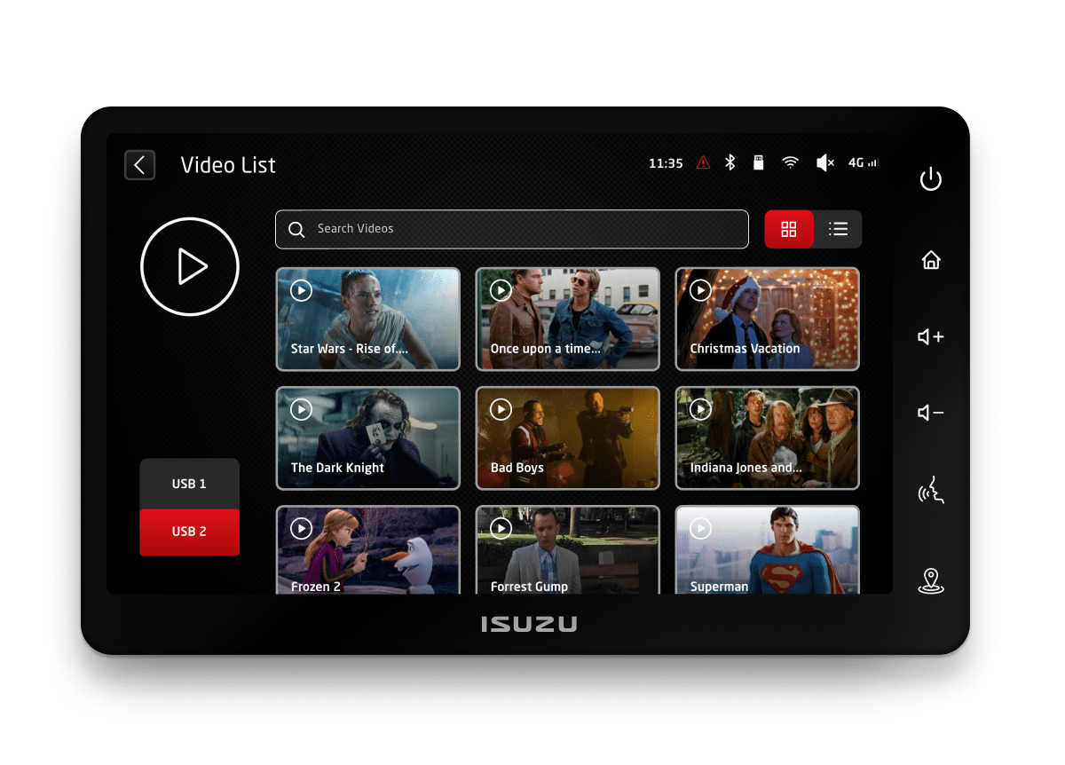
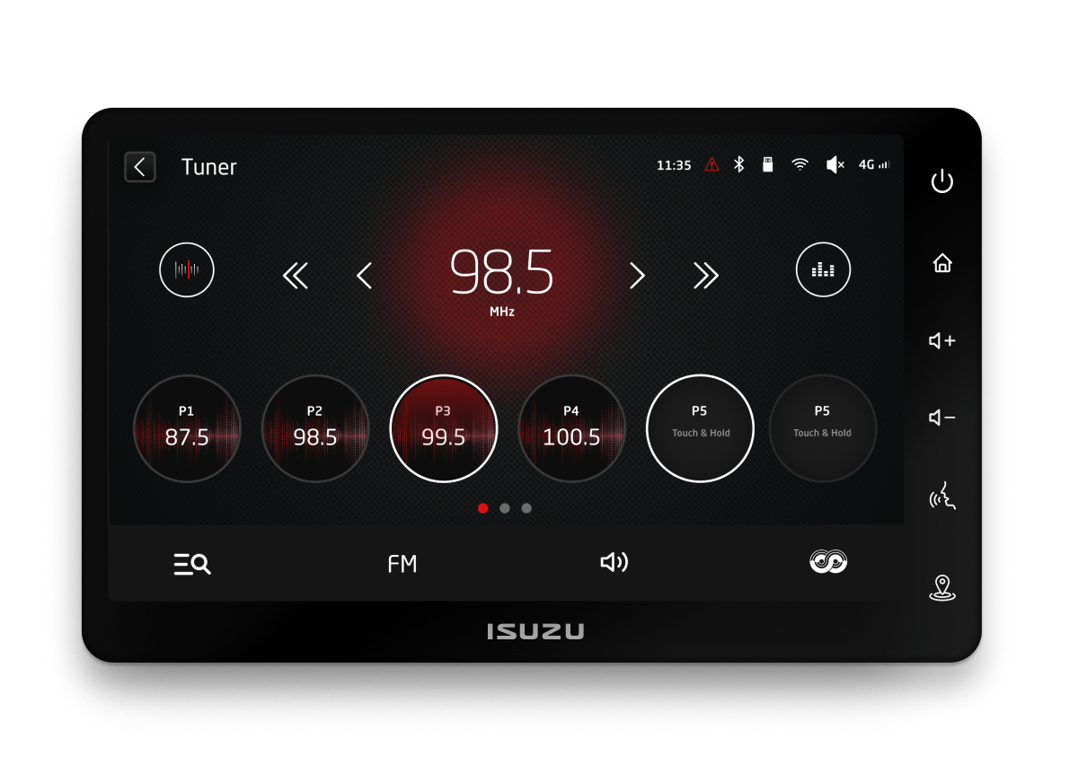
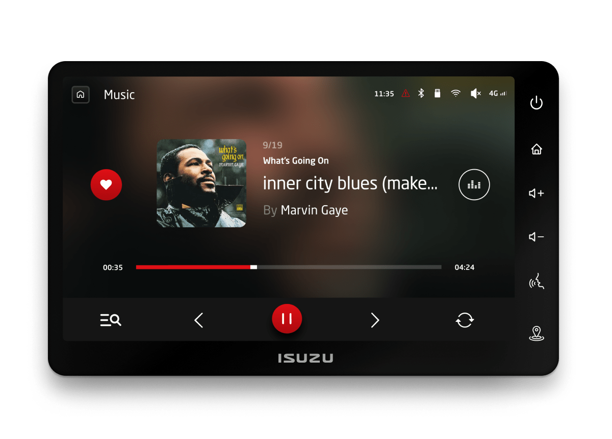
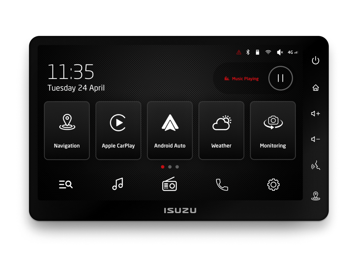
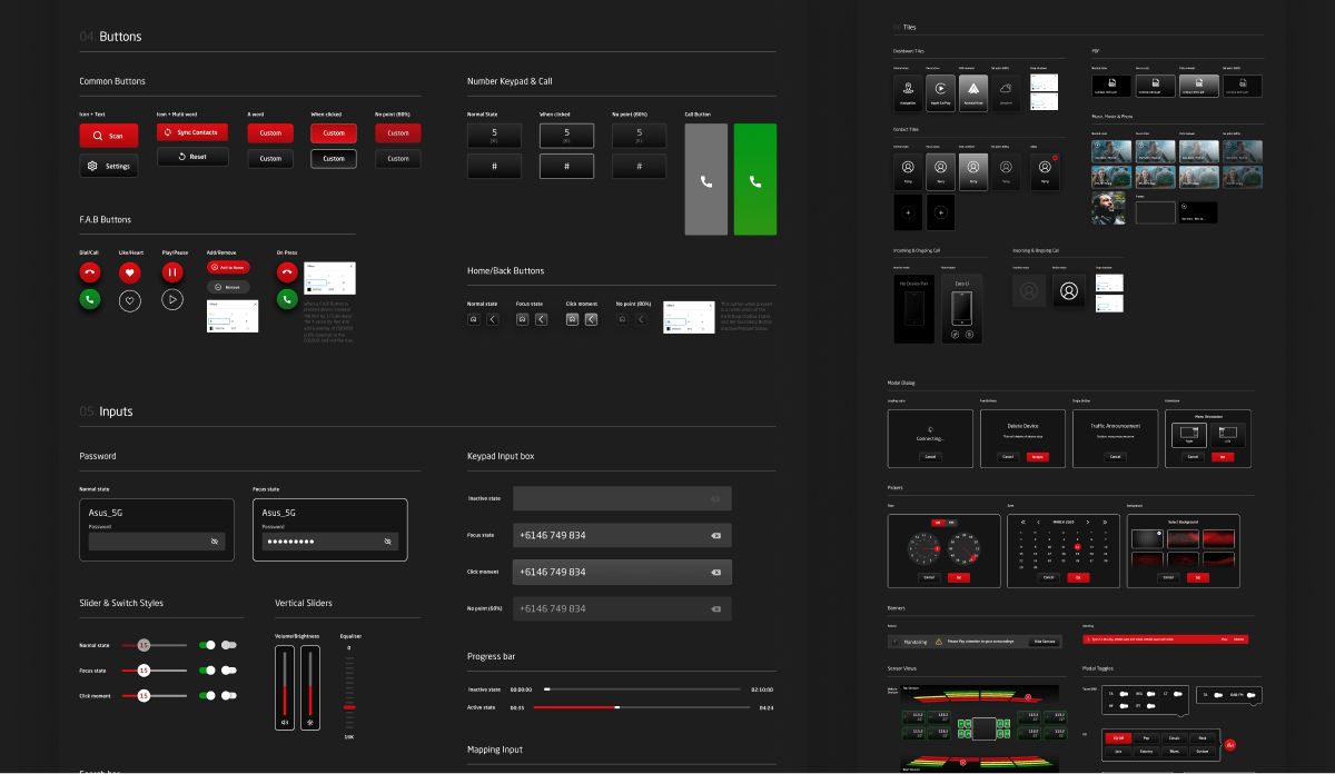
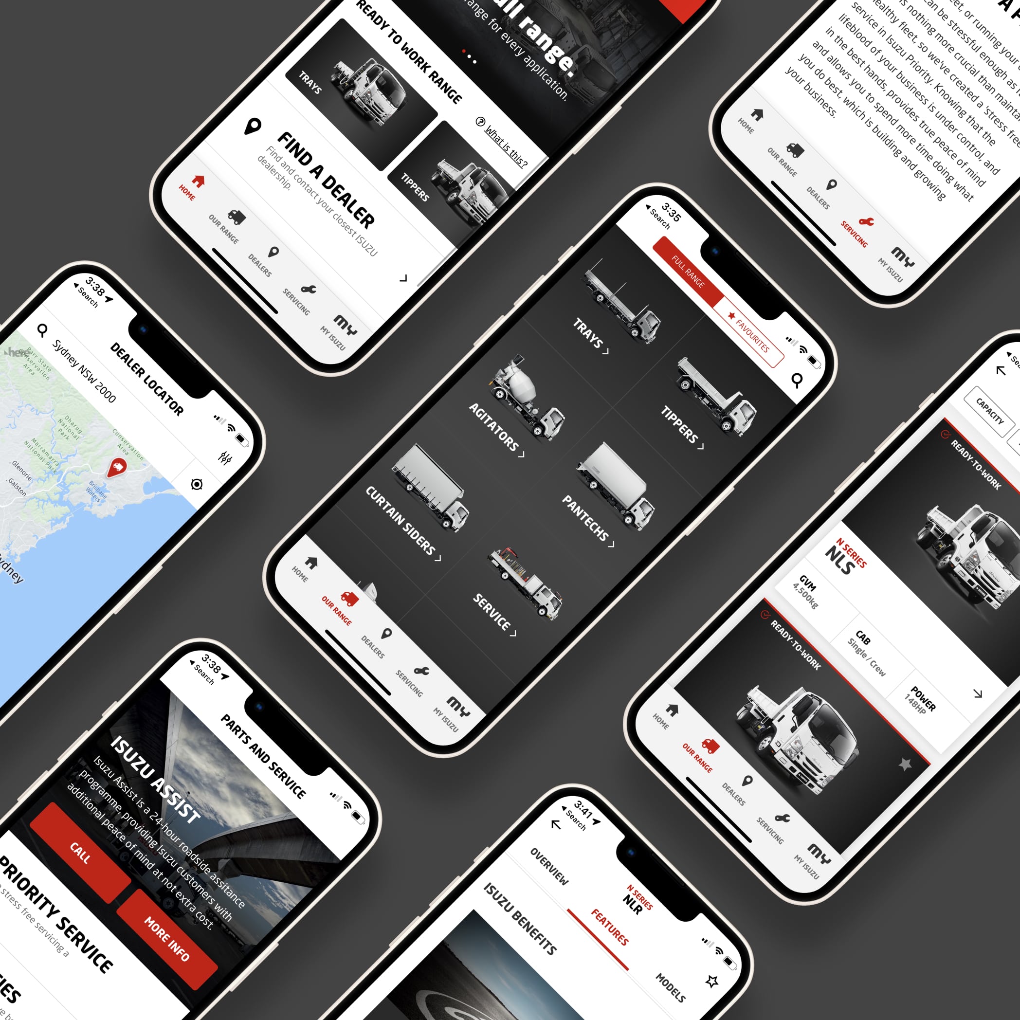
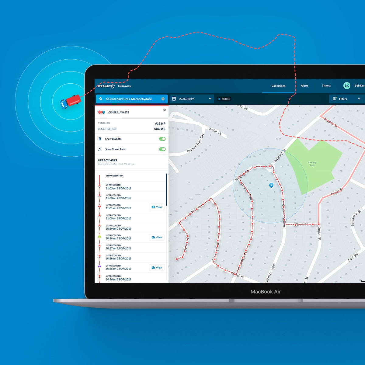
Our approach was progressive, commencing with simple prototypes and advancing to a unified design system before culminating in a final user- validated concept. Our focus was to understand how users navigate the system. We tested the logic behind interaction flows to ascertain their ease- of-use and to make sure they weren’t a potential distraction for drivers. And icons and patterns were also assessed continuously to ensure they were universally comprehensible. Feedback-driven refinements were gathered from sessions with prospective users.

